jadelennox (![[personal profile]](https://www.dreamwidth.org/img/silk/identity/user.png) jadelennox) wrote in
jadelennox) wrote in ![[site community profile]](https://www.dreamwidth.org/img/comm_staff.png) dw_accessibility2009-04-22 10:39 am
dw_accessibility2009-04-22 10:39 am
draft: how to write good userpic descriptions
I decided to write up a draft of how to write good userpic descriptions, because I am busily writing my own. (It takes a long time to write descriptions for 100+ userpics!) I am putting the draft here for kibitzing. Note that I am not a documentation writer by trade, and this is probably much too long and detailed! If somebody says "jadelennox, that's crap, I'm rewriting from scratch," I won't get offended.
If you take a look at your userpic edit page, you will see three available fields for you to describe the image: keyword, comment, and a new field, description.
In the journaling world, icons have become part of the vocabulary by which we communicate. Without meaningful alternative text, part of the conversation is obscured from those users who cannot see the images.
Deciding what descriptive text is meaningful is really up to you. If one of your icons is a beautiful abstract swirl of colors, and possibly that's the information you want to convey, and your descriptive text would be "Beautiful abstract swirl of colors". Alternately, you might not think that's important, and your descriptive text might be "jadelennox's userpic". If your icon has legible text on it, you probably want to include that legible text in your userpic description.
Take this icon, for example: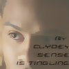 When I come up with the descriptive text for this image I need to decide what information I want to convey. The text, definitely. The fact that it is an image of the character Clyde Langer, probably. Should the descriptive text convey the source material for the image and the quotation (Sarah Jane Adventures)? I suspect so, because that's something I will probably be communicating when I use this userpic. Do I think it's important that the image is a close-up of Clyde's face? Probably not.
On the other hand, with this icon , I am much more likely to want to describe the visual layout of the image and not the character and the source material. When using this icon, it wouldn't be that important to me that everyone know this is the recurring eponymous character Liz from the Liz Prince mini-comics, and it wouldn't even be that important that they know the text bubble contains the words "Ha Ha". On the other hand, it would be important to me that my readers know this is a cartoon of a laughing girl playing a tiny violin on a sea of tears.
In general, when writing your descriptive text, think about what your userpic is trying to convey. Is it important the image is of Rachel Maddow, is it important that the woman in the image is sticking out her tongue, or is it important that the text says "Bitch, please"?
If you were going to make a Gratuitous Icon Post or use the phrase "*points to icon*" somewhere in the text of your entry, what about that icon is the important thing to convey?
To give you an idea of how your userpic descriptive text will appear to a user who doesn't see the images, we have produced some renditions of a miniature post using various non-image displaying technologies.
[Include a screen shot of a brief sample post in a new standard browser with images turned off, maybe with styles turned off and high contrast on just for extra]
[include a screen shot of the same post in lynx]
[Include a sound file of Jaws reading that post aloud]
[Anything else?]
(rb, we haven't developed a tags list yet, but I would lean towards tagging something like this "draft" and "draft-howto". And maybe something indicating what kind of documentation it is discussing?)
Userpic Descriptions: what they are, why they are there, and how to use them
Introduction
If you take a look at your userpic edit page, you will see three available fields for you to describe the image: keyword, comment, and a new field, description.
- Keyword is the familiar keyword field, which allows you to write quick descriptions to help you select your userpic from a drop-down list.
- Comment is the familiar comment field, which many users populate with extra information about their userpics, such as credit to the icon creator.
- Description is a new field, designed to increase accessibility by allowing you to give meaningful text alternatives to users who can't see your userpics.
In the journaling world, icons have become part of the vocabulary by which we communicate. Without meaningful alternative text, part of the conversation is obscured from those users who cannot see the images.
Picking meaningful alternative text
Deciding what descriptive text is meaningful is really up to you. If one of your icons is a beautiful abstract swirl of colors, and possibly that's the information you want to convey, and your descriptive text would be "Beautiful abstract swirl of colors". Alternately, you might not think that's important, and your descriptive text might be "
Take this icon, for example:
On the other hand, with this icon
In general, when writing your descriptive text, think about what your userpic is trying to convey. Is it important the image is of Rachel Maddow, is it important that the woman in the image is sticking out her tongue, or is it important that the text says "Bitch, please"?
If you were going to make a Gratuitous Icon Post or use the phrase "*points to icon*" somewhere in the text of your entry, what about that icon is the important thing to convey?
Examples of userpic displayed using assistive technology
To give you an idea of how your userpic descriptive text will appear to a user who doesn't see the images, we have produced some renditions of a miniature post using various non-image displaying technologies.
[Include a screen shot of a brief sample post in a new standard browser with images turned off, maybe with styles turned off and high contrast on just for extra]
[include a screen shot of the same post in lynx]
[Include a sound file of Jaws reading that post aloud]
[Anything else?]
(
Userpic descriptions
Re: Userpic descriptions
no subject
The one thing you haven't got is to remember that audio is slower than reading text and can't be skimmed, and any given page may have lots of userpics - especially if there's lots of comments. These add up to keeping the description as short as it can be while still leaving it meaningful.
This is the part where we desperately need 10+ DW blind screen reader users to let us know their preferences, honestly. I can listen to VoiceOver read the web page to me but I'll never know what it's like reading web pages via audio every time I access DW. None of us who don't use audio access will, and I don't know any other service that has described user icons in the way we do now. So we have to develop our own "best practice" for it. That means, basically, figuring out what people prefer. That's just going to have to happen over time unfortunately, because we just don't have enough users to tell us their preferences yet :(
no subject
I definitely hope that we create a space that is very welcoming and encouraging to users with a multitude of disabilities to come and tell us about their experiences. Possibly the fact that so many of the developers have disabilities will meet that more welcoming. *g*
no subject
I agree wholeheartedly with this :) Do you think it would work if we restricted it to one or two descriptive words and the username? Gaspodia's swirly icon or Gaspodia's swirly blue icon etc.
no subject
That's a good point! I wasn't approaching it quick right. Thanks.
no subject
But on a tangent, I saw someone mention that "text alternative" is a better label than "description", since "description" could cause people to focus on the wrong aspect of the icon. Yes? No? (this is probably one for the site copy team to change, if needed)
no subject
no subject
Once the accessibility people are happy with all of the content in this, should we give it over to the documentation team to standardize and bring in line with guidelines? Or should it stay informal, coming from the accessibility team and not necessarily in line with all of the site documentation standards?
no subject
in addition to the guidelines you've already written, i think it would be best to have an empty description in cases where icons are duplicating information that is already contained in the entry/comment -- e.g. for most default icons and for 'topic' icons that are always used in conjunction with related tags.
no subject
Do you think it's important to open an enhancement request that would give people a checkbox for "don't bother providing alternative text for this userpic?" I feel like the only people who would actually use that checkbox would be the kind of people who pay enough attention to their userpics that they would always want alternative text.
no subject
And the description field is now supposed to be a longer version of that? Or am I supposed to leave the comments empty because the icons are all by me so there is no meta info on the icon, and the description is now supposed to be what I did in the comment field, only longer? Also, are the keywords displayed too? I thought people would see those, so sometimes my comments don't include stuff the keyword already says, for example my icon with the keyword "sigh" has the comment "Dejected!RatCreature" and a detailed description would be something like "a dejected RatCreature sitting slumped over with the text *sigh* written above". But that seems putting a lot of redundant text in, because really the only info that icon gives is "I'm feeling down".
I guess I'm not sure whether I should duplicate the info in several fields, use the comment field differently, or just leave some fields blank. My icons don't really have complicated messages or picture content most of the time, but are either a single mood, activity or fandom/character indication, and that's all the info they contain.
no subject
Keywords are displayed if the description field is left blank, so if you just want to leave the description field entirely blank, then the keyword is what will show up. So if you are happy with "sigh" as the alternative text, just leave the description field entirely blank. If you have multiple keywords for a single icon, the one you used will show up (or all of them, if you didn't use a keyword to select that icon).
In other words, if all the information they contain is described by their single keyword, then you are golden, and you don't need to use the description field at all.
But you also want to avoid using lots of specialized punctuation: "{{{}}}", or "!" as a delimiter in your alternative text. For people using text to speech, that punctuation is most likely to be completely ignored, and if it's read aloud, might have an effect you don't expect. If you are using very widely used special punctuation (e.g. "*hugs*"), then there is at least a chance that the individual might have configured her text-to-speech functionality to make it clear the punctuation is there in some other way (e.g. speaking the text as if it were bolded). But out-of-the-box, Jaws said "{{{hugs}}}" as "left brace left brace left brace hugs right brace right brace right brace". The idea in alternative text is that it should be exactly and only what you want to convey, keeping in mind that it is very likely to be read aloud. Somebody upthread pointed out that this document should be amended to say "keep in mind that you can't really skim with text-to-speech, so you have to balance being descriptive with being brief.)
no subject
So I guess if an existing description shows without the keyword, and the comment field doesn't, I'll combine them for the new description field, because I think a useful description of my icons needs to mention the for me redundant information that my icons show my cartoon avatar, not the actual fandom characters. Otherwise people who don't know I have an icon theme would probably assume there was a photo image of the character.
Thanks for clarifying the fields for me.
no subject
no subject
r